Calming Color Inspiration From
Famous Serene Paintings
Since we have all been spending more time at home in the past year, many of us have taken to redecorating our spaces. Interior decorating leaves so much room for creativity and self-expression, and it allows us to curate our homes with artful colors and décor pieces that inspire us.
It can be difficult to choose the best colors for your furniture, home décor, and accent pieces. However, if you’re interested in calming interior design palettes, you can learn more about some of the most soothing colors below through famous paintings that incorporate them. Then, take a look at the décor ideas paired with each painting to envision how each palette can benefit your environment.
Blue
Blue is thought to be one of the most calming colors. Soft blues evoke feelings of contemplation, depth, and gentleness. They bring to mind both water and sky. Blues make for beautifully serene spaces, and are great options for paint colors and furniture pieces.
Hokusai’s famous woodblock painting The Great Wave off Kanagawa is an example of a painting with a pleasing palette thanks to its interplay of Prussian blue and indigo. It also incorporates a both pale yellow and a soft peach, serving as lovely compliments to the deep blue of the wave. Below you can find color and décor inspiration for incorporating the blues of this painting into your space.

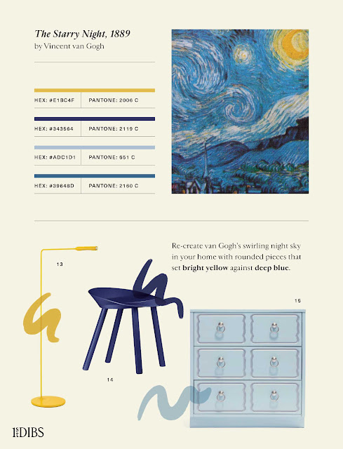
Van Gogh’s The Starry Night is another example of an iconic painting that incorporates blue. Van Gogh’s blue color palette is more lively and cosmic, broken up by specks of white and the bright yellow moon and stars.
Green
Green is often a calming color that reminds us of the peace found in nature. Imagining lush plants and dense forests can boost your mood and leave you feeling refreshed and relaxed.
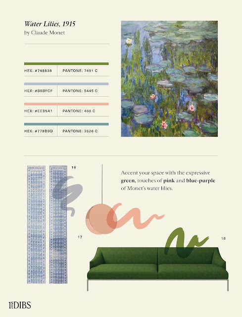
Monet painted hundreds of versions of the water lilies in his garden in Giverny, France. Like many of them, this one includes not only the blue of the water, but the deep greens of the vegetation in and around it. The painting’s color palette pairs this forest green with light pinks and purples. If you’d like to incorporate more green into your space, take inspiration from this masterpiece.
Yellow
Yellow is commonly associated with happiness, brightness, and warmth. It can be the perfect color to include if you would like to insert some energy into your space.
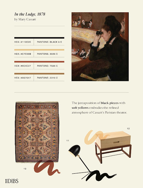
Mary Cassatt’s Impressionist painting In the Lodge weaves lovely golden-yellows with other warm-toned pigments, such as red and brown. Depicting a Parisian opera, the painting has an elegant and inviting atmosphere, one which you can capture at home by choosing traditional décor with a similar palette.
Observing art history’s iconic works can help you learn what kinds of calming color relationships speak to you most and choose which ones will best suit your living space. However, color inspiration is all around us—if you come across any scene that moves you, take note of the colors so you can recreate them at home or in your own works.
No comments:
Post a Comment